
I’m not crazy about my latest iphone upgrade.
Or my new coffeemaker, for the matter.
Let me explain.
As I write this, Word – a needy little bitch if ever there was one – is notifying me once again that I should update. Nevermind that I see these pleas when I’ve opened Word on my Macbook Pro and I’m trying to get some work done so no, I don’t plan on updating now.
Not to mention the number of times Google Chrome asks me to update.
I wouldn’t mind the updates if I thought they’d have a good outcome. But too often lately it seems like companies update their products – I’m not even talking about just tech products here – based on bad design.
Example: I had to buy a new Mr. Coffee coffeemaker recently when our old one – about seven years old – began leaking water I’d poured in. I got a new one because I didn’t relish the idea of getting electrocuted before I’d had my coffee.
So I picked out the basic model, which seemed to be the same 12-cup coffeemaker as I’d had and began using it. Immediately I noticed that the water level indicator is tucked away on the side, presumably to make the coffeemaker more narrow and more sleek. (Nevermind that I could only find it in black, which might hide coffee stains better than white but is harder to tell how much water you’ve poured in.) If I want to double-check how much water I’ve poured in, because of the place Mr. Coffee is tucked away in our tiny kitchen, I have to pull it forward on the counter and turn it to peer at it.
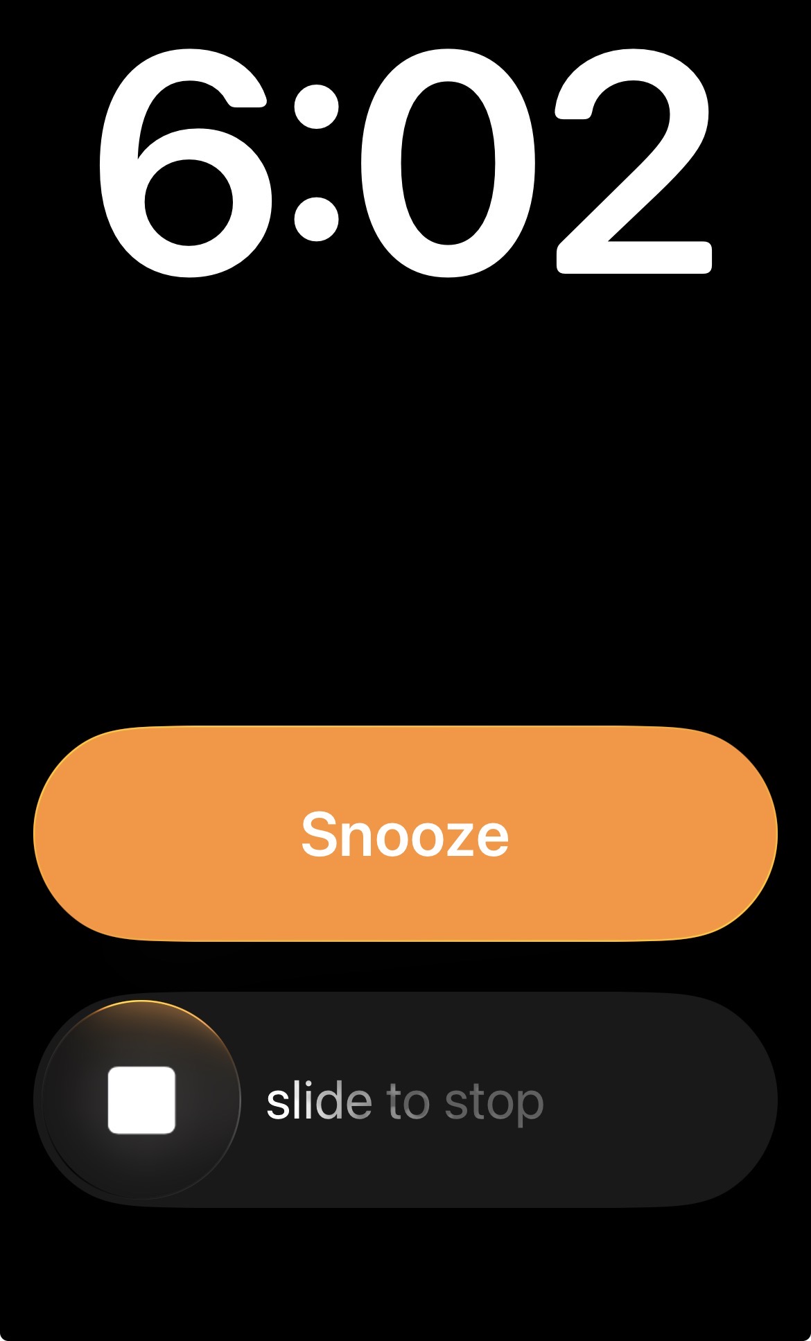
More annoying is a recent upgrade to my iphone – I bet you wondered wtf I was going to get to that – changed the way you can turn off notifications like the alarm indicator you see above.
In the past, the phone has offered a single button to tap to end an alarm or notification. Now you have to slide the notification.
No one at Apple thought about how hard this was to do with one hand. I can’t any longer turn off a notification casually with a single tap. Now I have to hold my phone in one hand and “swipe” with the other.
This change seemed to occur right about the time Apple introduced liquid glass, its “unified visual theme for the graphical user interfaces.”
Yes, by all means, you techboy schmucks, make apps and labels on your products transparent and harder to see.
You’d think someone could get paid hundreds of thousands of dollars – maybe millions in stock – to advise these companies on how not to piss off their low-vision or low-dexterity or low-mobility users?
Maybe I should apply for the job.
